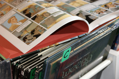
ESA SAINT-LUC LIEGE BIBLIOTHEQUE
ACCES COMPTE LECTEUR :
à la demande via l'adresse mail de la bibliothèque.
Catégorie Arts graphiques -- Design

Documents disponibles dans cette catégorie (6)


 Ajouter le résultat dans votre panier Affiner la recherche Interroger des sources externes
10.19 - 2019-10-14 (Bulletin de Novum)


Titre : 10.19 - 2019-10-14 Type de document : texte imprimé Année de publication : 2019 Langues : Allemand (ger) Anglais (eng) Catégories : Affiches -- 21e Siècle
Aliments -- Conditionnement
Arts graphiques -- 21e siècle
Arts graphiques -- Design
Arts graphiques -- Mise en page et typographie
Arts graphiques -- Norvège -- 21e siècle
Bauhaus
Bauhaus -- Publicité -- Europe
Gaufrage
Impression numérique
Impression sérigraphique
Impression sur étoffes -- Design
Livres -- Couvertures
Livres d'artistes
Papier -- Dans l'art
Périodiques -- Couvertures
Publicité -- Mise en page et typographie -- 20e siècle
Réalité augmentée
Scheinberger, Felix (1969-....)
Textiles et tissus -- Design
Vieux papiers -- RecyclageIndex. décimale : 766 Arts graphiques Résumé : The Oktoberfest in Munich is not normally relevant to the design world, but in this issue of novum it serves as a wonderful source of inspiration for the cover, which is quite literally an all-round delight. On a standard recycling card we used different hot-foil stampings, adding micro-embossing for stylish accent. A total of four different colour variants was produced, finished with two foils in silver and gold and a gold spot colour – the wrap-around motif comes from the Munich design agency Milch+Honig.
Other great projects that exploit the possibilities of paper, print and finishing can be found in our novum+ and Showroom sections. There you can enjoy first-class design from France, Hungary, Norway and the Netherlands, as well as eight pages of prize-winning posters from Germany, Austria and Switzerland.Note de contenu : Paper & Print
Multisensorics is a big theme at the moment in marketing and communication. After all, we human beings don´t just see, we can also feel, hear and smell. Things that appeal to us on several levels are therefore perceived more intensively, we feel them to be more positive and we remember them for longer.
Unusually designed print products can achieve this sustained effect. In the novum+ section this month we bring you lots of exciting examples, such as intelligently conceived packaging, illustrations with hand-made charm and campaigns that attract attention through high-quality finishes. Also there´s lots to discover about recycling papers, beautiful books and sophisticated CIs.
In the Showroom section Dutch designer Gilles de Brock explains how coding can boost creativity. Treize Grammes from France takes an opposite line, building charming settings by hand, and Kind from Norway impresses with visual identities that combine emotions with Nordic minimalism. Patrick Rössler presents graphic design treasures from the Bauhaus era, the Hungarian design agency Classmate shows how designers collaborate across different countries and still manage to maintain a coherent line in terms of design. Last, but not least, we interviewed Anette Lenz, jury member of the competition »100 Best Posters — Germany, Austria, Switzerland«, about trends and the meaning of posters today.
The cover
Why just one cover, when you can have a variety? Embracing this idea, the October issue of novum appears in four different colours and was embossed with two different hot foils and a gold spot colour. For the first time we also used micro-embossing, a technique that enables very fine details to be worked into the embossing die. Often this technique is used in protection against forgery, but as you see from our cover, it is also a great way to create intriguing optical accents.
On the wrap-around cover we used five embossing dies in different sizes, made by MSP Prägetechnik. As both larger areas and also fine details were embossed, it was necessary to do extensive testing to produce the best results with foils (Kurz) and paper (RecyCard from Papyrus Deutschland). The embossing itself also required great skill and sensitivity and that was delivered superbly by August Conzelmann AG.
The design on the cover comes from Milch+Honig, and, as a design bureau based in Munich, for the October issue the subject foremost in many people´s minds here is the Oktoberfest. As the designers at Milch+Honig have extensive experience with high-end print products, the finishing technique, the paper and the design were all expertly coordinated to produce a beautiful and successful result.
And, as masters of all that, Milch+Honig went one step further: with micro-embossing to integrate hidden messages. Working with the motion agency Paul Bewegt, they also concealed one or two things in the cover of novum – digitally, you understand. Using augmented reality parts of the cover can be brought to life – you can see this via an app on your smartphone or tablet.
Inhalt
Showroom
Gilles de Brock
Classmate
Kind
Treize grammes
100 Beste Plakate
Bauhaus
novum+
Clormann Design
WRK
Recycling Papiere
Anna Niestroj
Luminous
Editions Non Standard
Commission
Anagrama
Cover design: Milch+Honig
Paper: Papyrus Deutschland
Hot foil & micro embossing: August Conzelmann GmbH
Stamping die: MSP Prägetechnik
Foils: Kurz
Offset: f&w Medien
Augmented Reality: Paul Bewegt
Photography: Janina Engel, Tobias HolzmannEn ligne : https://novum.graphics/en/magazine/archive/detail/novum-1019/ [n° ou bulletin] 10.19 - 2019-10-14 [texte imprimé] . - 2019.
Langues : Allemand (ger) Anglais (eng)
Catégories : Affiches -- 21e Siècle
Aliments -- Conditionnement
Arts graphiques -- 21e siècle
Arts graphiques -- Design
Arts graphiques -- Mise en page et typographie
Arts graphiques -- Norvège -- 21e siècle
Bauhaus
Bauhaus -- Publicité -- Europe
Gaufrage
Impression numérique
Impression sérigraphique
Impression sur étoffes -- Design
Livres -- Couvertures
Livres d'artistes
Papier -- Dans l'art
Périodiques -- Couvertures
Publicité -- Mise en page et typographie -- 20e siècle
Réalité augmentée
Scheinberger, Felix (1969-....)
Textiles et tissus -- Design
Vieux papiers -- RecyclageIndex. décimale : 766 Arts graphiques Résumé : The Oktoberfest in Munich is not normally relevant to the design world, but in this issue of novum it serves as a wonderful source of inspiration for the cover, which is quite literally an all-round delight. On a standard recycling card we used different hot-foil stampings, adding micro-embossing for stylish accent. A total of four different colour variants was produced, finished with two foils in silver and gold and a gold spot colour – the wrap-around motif comes from the Munich design agency Milch+Honig.
Other great projects that exploit the possibilities of paper, print and finishing can be found in our novum+ and Showroom sections. There you can enjoy first-class design from France, Hungary, Norway and the Netherlands, as well as eight pages of prize-winning posters from Germany, Austria and Switzerland.Note de contenu : Paper & Print
Multisensorics is a big theme at the moment in marketing and communication. After all, we human beings don´t just see, we can also feel, hear and smell. Things that appeal to us on several levels are therefore perceived more intensively, we feel them to be more positive and we remember them for longer.
Unusually designed print products can achieve this sustained effect. In the novum+ section this month we bring you lots of exciting examples, such as intelligently conceived packaging, illustrations with hand-made charm and campaigns that attract attention through high-quality finishes. Also there´s lots to discover about recycling papers, beautiful books and sophisticated CIs.
In the Showroom section Dutch designer Gilles de Brock explains how coding can boost creativity. Treize Grammes from France takes an opposite line, building charming settings by hand, and Kind from Norway impresses with visual identities that combine emotions with Nordic minimalism. Patrick Rössler presents graphic design treasures from the Bauhaus era, the Hungarian design agency Classmate shows how designers collaborate across different countries and still manage to maintain a coherent line in terms of design. Last, but not least, we interviewed Anette Lenz, jury member of the competition »100 Best Posters — Germany, Austria, Switzerland«, about trends and the meaning of posters today.
The cover
Why just one cover, when you can have a variety? Embracing this idea, the October issue of novum appears in four different colours and was embossed with two different hot foils and a gold spot colour. For the first time we also used micro-embossing, a technique that enables very fine details to be worked into the embossing die. Often this technique is used in protection against forgery, but as you see from our cover, it is also a great way to create intriguing optical accents.
On the wrap-around cover we used five embossing dies in different sizes, made by MSP Prägetechnik. As both larger areas and also fine details were embossed, it was necessary to do extensive testing to produce the best results with foils (Kurz) and paper (RecyCard from Papyrus Deutschland). The embossing itself also required great skill and sensitivity and that was delivered superbly by August Conzelmann AG.
The design on the cover comes from Milch+Honig, and, as a design bureau based in Munich, for the October issue the subject foremost in many people´s minds here is the Oktoberfest. As the designers at Milch+Honig have extensive experience with high-end print products, the finishing technique, the paper and the design were all expertly coordinated to produce a beautiful and successful result.
And, as masters of all that, Milch+Honig went one step further: with micro-embossing to integrate hidden messages. Working with the motion agency Paul Bewegt, they also concealed one or two things in the cover of novum – digitally, you understand. Using augmented reality parts of the cover can be brought to life – you can see this via an app on your smartphone or tablet.
Inhalt
Showroom
Gilles de Brock
Classmate
Kind
Treize grammes
100 Beste Plakate
Bauhaus
novum+
Clormann Design
WRK
Recycling Papiere
Anna Niestroj
Luminous
Editions Non Standard
Commission
Anagrama
Cover design: Milch+Honig
Paper: Papyrus Deutschland
Hot foil & micro embossing: August Conzelmann GmbH
Stamping die: MSP Prägetechnik
Foils: Kurz
Offset: f&w Medien
Augmented Reality: Paul Bewegt
Photography: Janina Engel, Tobias HolzmannEn ligne : https://novum.graphics/en/magazine/archive/detail/novum-1019/ Réservation
Réserver ce document
Exemplaires(1)
Code-barres Cote Support Localisation Section Disponibilité SL 23875 Novum Fascicule ESA Saint-Luc Beaux-Arts - Biblio Disponible
Titre : no257(2020:septembre-octobre) - 2020-09-01 - Animaux. Sophy Hollington, HeeJae Kim. L'Éloi. Prague Type de document : texte imprimé Année de publication : 2020 Langues : Français (fre) Catégories : Affiches -- 21e Siècle
Animaux -- Dans l'art
Animaux -- Dans l'art -- Design -- 21e siècle
Arts graphiques -- 21e siècle
Arts graphiques -- Concours -- 21e siècle
Arts graphiques -- Design
Arts graphiques -- Périodiques -- États-Unis -- 20e siècle
Baskets (chaussures) -- Expositions -- Bordeaux (Gironde)
Brodovitch, Alexey (1898-1971)
Caricatures et dessins humoristiques -- France -- 19e siècle
Communication visuelle -- 21e siècle
Déformation (esthétique)
Demirdag, Pinar (1985-....)
Design -- Concours -- 21e siècle
Forme (esthétique)
GRAME (Lyon) -- Identité visuelle -- 21e siècle
Graphistes -- 21e siècle -- Entretiens
Harper's bazaar (périodique) -- Histoire et critique
Illustration des livres -- 21e siècle
Illustratrices -- France -- 21e siècle -- Entretiens
Industrie de la musique et du son -- Identité visuelle -- 21e siècle
Linogravure -- 21e siècle
Morichon, Léa
Portfolio (périodique) -- Histoire et critique
Renate, Viola
Typographie -- 21e siècleIndex. décimale : 766 Arts graphiques Résumé : Édito
À bon chat, bon rat
Êtes-vous plutôt… caractère de cochon ou poule mouillée ? Appétit d’oiseau ou faim de loup ? Les expressions utilisant les noms d’animaux abondent. Liés depuis toujours à cette grande famille qu’est le règne animal, nous ne cessons de jouer la ressemblance et la distinction avec ces lointains cousins. L’« Hu-main », doté de « mains » et donc d’un pouce préhenseur, est capable de manipuler les objets avec précision et de dessiner son propre monde. Grâce à cette distinction, il quitte sa vile condition, côtoyant le statut divin. L’« ani-mal », lui, selon cette logique lexicale peu scrupuleuse, serait le mal incarné, le mal animé. Sans religion, croyance, sagesse… sans ambition… sans travail, ni d’autre objectif que de survivre et de procréer, un incapable, en somme, bon à se rouler dans la fange, à traînasser… C’est en tout cas ce qu’en pensent quelques petits hommes bien rehaussés dans leurs souliers. Faut-il qu’ils commencent à disparaître en masse que nous leur concédions un tant soit peu de valeur ? N’y a-t-il que le statut de rareté pour susciter l’intérêt et la reconnaissance des hommes ? Comme dans les placements financiers, une denrée en voie de raréfaction attise les investissements, peu importe qui seront les perdants… Braconnage et massacres d’espèces ne sont que la partie émergée de l’iceberg. Riches en ressources, leurs milieux naturels, déjà fragilisés par la pollution, ne sont pas épargnés. Leur destruction entraîne irrémédiablement celle de nombreuses espèces. « Loups », « corbeaux », « renards » dévoilent d’autres visages, plus familiers. Et les vices dont nous les avions gratifiés se révèlent n’être que les reflets des turpitudes humaines. La Fontaine s’en régalait dans ses fables. Leurs images sont des projections de nous-mêmes. Un puma sur des chaussures de sport, un cheval sur une voiture, un écureuil sur la façade d’une banque, une panthère ou un python sur une campagne de mode… dès les premiers blasons, de nombreuses identités visuelles se sont emparées de leurs symboliques. Accompagnant un renouveau sociétal où tout rapport hiérarchique est remis en question, de nombreuses recherches étayent désormais les similitudes com- portementales entre hommes et animaux. La compréhension de la sensibilité, et des émotions de ceux qui ne détiennent pas le langage fait peu à peu vaciller le statut de subalternes que nous leur avions octroyé. En même temps que nos regards se sont affinés, nos sujets d’observation ont gagné en profondeur. Ce numéro s’attache à regarder l’évolution de l’image animale qui en découle à travers ses différentes utilisations.
Par Caroline Bouige
Couverture
Créatrices d’images, Pinar Demirdag et Viola Renate divisent leur activité entre une production artistique et un studio de design. Inspirée par la nature, la mythologie et la science-fiction, l’esthétique qu’elles développent fuit les archétypes de la belle image et entre dans l’expérimentation. En 2010, le duo réalise la série « The Credit Card Collection », présentée page 148.
www.pinar-viola.comEn ligne : https://etapes.com/edition/etapes-257/ [n° ou bulletin] no257(2020:septembre-octobre) - 2020-09-01 - Animaux. Sophy Hollington, HeeJae Kim. L'Éloi. Prague [texte imprimé] . - 2020.
Langues : Français (fre)
Catégories : Affiches -- 21e Siècle
Animaux -- Dans l'art
Animaux -- Dans l'art -- Design -- 21e siècle
Arts graphiques -- 21e siècle
Arts graphiques -- Concours -- 21e siècle
Arts graphiques -- Design
Arts graphiques -- Périodiques -- États-Unis -- 20e siècle
Baskets (chaussures) -- Expositions -- Bordeaux (Gironde)
Brodovitch, Alexey (1898-1971)
Caricatures et dessins humoristiques -- France -- 19e siècle
Communication visuelle -- 21e siècle
Déformation (esthétique)
Demirdag, Pinar (1985-....)
Design -- Concours -- 21e siècle
Forme (esthétique)
GRAME (Lyon) -- Identité visuelle -- 21e siècle
Graphistes -- 21e siècle -- Entretiens
Harper's bazaar (périodique) -- Histoire et critique
Illustration des livres -- 21e siècle
Illustratrices -- France -- 21e siècle -- Entretiens
Industrie de la musique et du son -- Identité visuelle -- 21e siècle
Linogravure -- 21e siècle
Morichon, Léa
Portfolio (périodique) -- Histoire et critique
Renate, Viola
Typographie -- 21e siècleIndex. décimale : 766 Arts graphiques Résumé : Édito
À bon chat, bon rat
Êtes-vous plutôt… caractère de cochon ou poule mouillée ? Appétit d’oiseau ou faim de loup ? Les expressions utilisant les noms d’animaux abondent. Liés depuis toujours à cette grande famille qu’est le règne animal, nous ne cessons de jouer la ressemblance et la distinction avec ces lointains cousins. L’« Hu-main », doté de « mains » et donc d’un pouce préhenseur, est capable de manipuler les objets avec précision et de dessiner son propre monde. Grâce à cette distinction, il quitte sa vile condition, côtoyant le statut divin. L’« ani-mal », lui, selon cette logique lexicale peu scrupuleuse, serait le mal incarné, le mal animé. Sans religion, croyance, sagesse… sans ambition… sans travail, ni d’autre objectif que de survivre et de procréer, un incapable, en somme, bon à se rouler dans la fange, à traînasser… C’est en tout cas ce qu’en pensent quelques petits hommes bien rehaussés dans leurs souliers. Faut-il qu’ils commencent à disparaître en masse que nous leur concédions un tant soit peu de valeur ? N’y a-t-il que le statut de rareté pour susciter l’intérêt et la reconnaissance des hommes ? Comme dans les placements financiers, une denrée en voie de raréfaction attise les investissements, peu importe qui seront les perdants… Braconnage et massacres d’espèces ne sont que la partie émergée de l’iceberg. Riches en ressources, leurs milieux naturels, déjà fragilisés par la pollution, ne sont pas épargnés. Leur destruction entraîne irrémédiablement celle de nombreuses espèces. « Loups », « corbeaux », « renards » dévoilent d’autres visages, plus familiers. Et les vices dont nous les avions gratifiés se révèlent n’être que les reflets des turpitudes humaines. La Fontaine s’en régalait dans ses fables. Leurs images sont des projections de nous-mêmes. Un puma sur des chaussures de sport, un cheval sur une voiture, un écureuil sur la façade d’une banque, une panthère ou un python sur une campagne de mode… dès les premiers blasons, de nombreuses identités visuelles se sont emparées de leurs symboliques. Accompagnant un renouveau sociétal où tout rapport hiérarchique est remis en question, de nombreuses recherches étayent désormais les similitudes com- portementales entre hommes et animaux. La compréhension de la sensibilité, et des émotions de ceux qui ne détiennent pas le langage fait peu à peu vaciller le statut de subalternes que nous leur avions octroyé. En même temps que nos regards se sont affinés, nos sujets d’observation ont gagné en profondeur. Ce numéro s’attache à regarder l’évolution de l’image animale qui en découle à travers ses différentes utilisations.
Par Caroline Bouige
Couverture
Créatrices d’images, Pinar Demirdag et Viola Renate divisent leur activité entre une production artistique et un studio de design. Inspirée par la nature, la mythologie et la science-fiction, l’esthétique qu’elles développent fuit les archétypes de la belle image et entre dans l’expérimentation. En 2010, le duo réalise la série « The Credit Card Collection », présentée page 148.
www.pinar-viola.comEn ligne : https://etapes.com/edition/etapes-257/ Réservation
Réserver ce document
Exemplaires(1)
Code-barres Cote Support Localisation Section Disponibilité SL 24686 ETAPES Fascicule ESA Saint-Luc Beaux-Arts - Biblio Disponible
Titre : Le design graphique : Savoirs & savoir-faire Type de document : texte imprimé Auteurs : Élodie Palumbo, Auteur Editeur : [Paris] : Pyramyd Année de publication : DL 2023 Importance : 1 vol. (264 p.) Présentation : ill. en coul., couv. ill. en coul. Format : 26 cm ISBN/ISSN/EAN : 978-2-35017-528-7 Prix : 35 EUR Note générale : Bibliogr. p. 258-259. Webliogr. p. 259. Index Langues : Français (fre) Catégories : Arts graphiques -- Design
Communication écrite
TypographieIndex. décimale : 766 Arts graphiques Résumé :
La première partie de cet ouvrage est consacrée aux connaissances indispensables à tout graphiste.
Brève histoire et petit panorama de la discipline, savoirs fondamentaux et méthodologies sont au programme et vous livreront les clés pour comprendre ce qu'est le design graphique et en maîtriser les outils (signe, couleur, composition...).
La seconde partie du livre vous propose d'expérimenter, de mettre en pratique les connaissances acquises et de vous glisser dans la peau d'un designer professionnel.
Autour des trois champs d'exploration que sont le signe, la structure et la perception, une dizaine de cas concrets vous entraîneront à répondre à un brief, à explorer votre créativité et à produire des objets graphiques.Le design graphique : Savoirs & savoir-faire [texte imprimé] / Élodie Palumbo, Auteur . - [Paris] : Pyramyd, DL 2023 . - 1 vol. (264 p.) : ill. en coul., couv. ill. en coul. ; 26 cm.
ISBN : 978-2-35017-528-7 : 35 EUR
Bibliogr. p. 258-259. Webliogr. p. 259. Index
Langues : Français (fre)
Catégories : Arts graphiques -- Design
Communication écrite
TypographieIndex. décimale : 766 Arts graphiques Résumé :
La première partie de cet ouvrage est consacrée aux connaissances indispensables à tout graphiste.
Brève histoire et petit panorama de la discipline, savoirs fondamentaux et méthodologies sont au programme et vous livreront les clés pour comprendre ce qu'est le design graphique et en maîtriser les outils (signe, couleur, composition...).
La seconde partie du livre vous propose d'expérimenter, de mettre en pratique les connaissances acquises et de vous glisser dans la peau d'un designer professionnel.
Autour des trois champs d'exploration que sont le signe, la structure et la perception, une dizaine de cas concrets vous entraîneront à répondre à un brief, à explorer votre créativité et à produire des objets graphiques.Réservation
Réserver ce document
Exemplaires(1)
Code-barres Cote Support Localisation Section Disponibilité SL 26435 766 PAL Livre ESA Saint-Luc Beaux-Arts - Biblio Sorti jusqu'au 25/02/2025 Graphic design for art, fashion, film, architecture, photography, product design and everything in between / Andy Cooke
Titre : Graphic design for art, fashion, film, architecture, photography, product design and everything in between Type de document : texte imprimé Auteurs : Andy Cooke Editeur : Munich : Prestel Année de publication : 2018 Importance : 239 p. Présentation : ill. en coul., couv. ill. en coul. Format : 24 cm ISBN/ISSN/EAN : 978-3-7913-8350-7 Catégories : Arts graphiques -- Design
Communication visuelle et artIndex. décimale : 766 Arts graphiques Résumé :
This guide explores ways in which graphic designers can successfully collaborate with other creative professionals and sectors, whether it be a more sophisticated logo for a product, a better-designed lookbook for a fashion brand, or a more intuitive wayfinding system for a museum.
The book features exceptionally conceived design solutions across a variety of industries--from architecture and product design to art, fashion, and film.
Through dynamic spreads, readers will discover the Berlin-based studio Hort's transformative campaign for Nike; Base's responsive, flexible logo for Munich's Haus der Kunst museum; how design agency Bond worked with ArtRabbit, a website and app that catalogs contemporary art exhibitions, on a clever identity rollout; and how John Haslam, managing director of bespoke paper company G.F Smith, feels about the process of working with designers.
Each example illustrates the significance of the graphic designer's role in making a campaign marketable and successful. Insights from clients and the designers themselves reveal the inner workings of the design process. An indispensable reference for the graphic design industry, this visually arresting and informative volume shows how excellence can be achieved when creative minds work together.Graphic design for art, fashion, film, architecture, photography, product design and everything in between [texte imprimé] / Andy Cooke . - Munich : Prestel, 2018 . - 239 p. : ill. en coul., couv. ill. en coul. ; 24 cm.
ISBN : 978-3-7913-8350-7
Catégories : Arts graphiques -- Design
Communication visuelle et artIndex. décimale : 766 Arts graphiques Résumé :
This guide explores ways in which graphic designers can successfully collaborate with other creative professionals and sectors, whether it be a more sophisticated logo for a product, a better-designed lookbook for a fashion brand, or a more intuitive wayfinding system for a museum.
The book features exceptionally conceived design solutions across a variety of industries--from architecture and product design to art, fashion, and film.
Through dynamic spreads, readers will discover the Berlin-based studio Hort's transformative campaign for Nike; Base's responsive, flexible logo for Munich's Haus der Kunst museum; how design agency Bond worked with ArtRabbit, a website and app that catalogs contemporary art exhibitions, on a clever identity rollout; and how John Haslam, managing director of bespoke paper company G.F Smith, feels about the process of working with designers.
Each example illustrates the significance of the graphic designer's role in making a campaign marketable and successful. Insights from clients and the designers themselves reveal the inner workings of the design process. An indispensable reference for the graphic design industry, this visually arresting and informative volume shows how excellence can be achieved when creative minds work together.Réservation
Réserver ce document
Exemplaires(1)
Code-barres Cote Support Localisation Section Disponibilité SL 23888 766 COO Livre ESA Saint-Luc Beaux-Arts - Biblio Disponible
Titre : Los logos 8 Type de document : texte imprimé Auteurs : Michael Wolff (19XX-), Préfacier, etc. ; Robert Klanten, Éditeur scientifique ; Anja Kouznetsova, Éditeur scientifique ; Jonas Herfurth (19XX-...), Collaborateur ; Gestalten Verlag, Editeur commercial Editeur : Berlin : Gestalten Verlag GmbH Année de publication : 2017 Importance : 1 vol. (398 p.) Présentation : ill. en coul., couv. ill. en coul. Format : 20 cm ISBN/ISSN/EAN : 978-3-89955-694-0 Langues : Anglais (eng) Catégories : Arts graphiques -- Design
Conditionnement -- Marques de commerce
Logotypes -- DesignIndex. décimale : 766.126 Logos Résumé :
Los Logos 8, the classic compilation and thoughtfully curated showcase of current developments in logo design, delves into the realm of an ever-evolving and always present branding component.
Los Logos 8 is the authoritative reference on contemporary logo design. As with previous editions of Gestalten’s indispensable Los Logos series, this expertly curated collection is both a guide to the latest innovations and a prognostication of coming trends. This edition looks further into the ever-changing world of this vital element of branding: the logo. An inevitable task on a designer’s artistic and professional timeline, designing a logo is a lively and explorative mission.
The fully indexed compendium showcases an unparalleled selection of cutting-edge examples from around the globe. Interviews offer an inside look at the creative processes of leading studios and designers: take a look at the striking labels that Hired Guns Creative imagines for their many clients with the alcohol industry; delve into the designs that BankerWessel concocts for fine art exhibitions and publications; or study what has made Wolff Olins an industry leader and visionary for over five decades. A practical and insightful handbook of the current developments in logo design and a boundless source of inspiration, Los Logos 8 is a must-have for any designer, brand manager, trend scout, or marketing strategist.Los logos 8 [texte imprimé] / Michael Wolff (19XX-), Préfacier, etc. ; Robert Klanten, Éditeur scientifique ; Anja Kouznetsova, Éditeur scientifique ; Jonas Herfurth (19XX-...), Collaborateur ; Gestalten Verlag, Editeur commercial . - Berlin : Gestalten Verlag GmbH, 2017 . - 1 vol. (398 p.) : ill. en coul., couv. ill. en coul. ; 20 cm.
ISBN : 978-3-89955-694-0
Langues : Anglais (eng)
Catégories : Arts graphiques -- Design
Conditionnement -- Marques de commerce
Logotypes -- DesignIndex. décimale : 766.126 Logos Résumé :
Los Logos 8, the classic compilation and thoughtfully curated showcase of current developments in logo design, delves into the realm of an ever-evolving and always present branding component.
Los Logos 8 is the authoritative reference on contemporary logo design. As with previous editions of Gestalten’s indispensable Los Logos series, this expertly curated collection is both a guide to the latest innovations and a prognostication of coming trends. This edition looks further into the ever-changing world of this vital element of branding: the logo. An inevitable task on a designer’s artistic and professional timeline, designing a logo is a lively and explorative mission.
The fully indexed compendium showcases an unparalleled selection of cutting-edge examples from around the globe. Interviews offer an inside look at the creative processes of leading studios and designers: take a look at the striking labels that Hired Guns Creative imagines for their many clients with the alcohol industry; delve into the designs that BankerWessel concocts for fine art exhibitions and publications; or study what has made Wolff Olins an industry leader and visionary for over five decades. A practical and insightful handbook of the current developments in logo design and a boundless source of inspiration, Los Logos 8 is a must-have for any designer, brand manager, trend scout, or marketing strategist.Réservation
Réserver ce document
Exemplaires(1)
Code-barres Cote Support Localisation Section Disponibilité SL 23837 766.126 WOL Livre ESA Saint-Luc Beaux-Arts - Biblio Disponible
Permalink