ESA SAINT-LUC LIEGE BIBLIOTHEQUE
ACCES COMPTE LECTEUR :
à la demande via l'adresse mail de la bibliothèque.
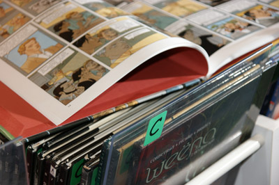
Catégorie Collage (art)

Documents disponibles dans cette catégorie (30)


 Ajouter le résultat dans votre panier Affiner la recherche Interroger des sources externes
N°8 (2022) - 2022-12-09 (Bulletin de Facettes)

Titre : N°8 (2022) - 2022-12-09 Titre original : Croisement(s) Type de document : texte imprimé Année de publication : 2022 Note générale : Le vendredi 9 décembre 2022, nous vous donnions rendez-vous au LaM, Villeneuve d'Ascq le temps d'un après-midi, afin de célébrer ensemble la sortie de ce huitième numéro de la revue FACETTES.
AU PROGRAMME
· 14h30 : Accueil
· 15h : Mot d'accueil et présentation de la revue suivie d'une table ronde
· 16h30 : Cocktail et visite libre des expositions en cours
TABLE RONDE
EN PRÉSENCE DE CONTRIBUTEURS DU NUMÉRO
· Aurélie Belair, artiste plasticienne
· Alexia Creusen, artiste plasticienne, historienne de l'art et professeure de l'école supérieure des arts Saint-Luc à Liège (pour le collectif Les Rayons)
· Maud Dallemagne, illustratrice (pour le collectif Les Rayons)
· Louis Émauré, docteur en Histoire de l'art , dessinateur et chercheur associé au Centre de recherche Mondes Modernes et Contemporains de l'Université libre de Bruxelles
· Marion Roy, commissaire d'exposition
· Réjane Sourisseau, chargée d'études pour différents réseaux professionnels, la Fondation Carasso (programme Art), la Fondation de France (Département Cultures et création) // associée au master Métiers de la culture, Université de Lille
· Mélanie Rainville, à la modération. Historienne de l'art, intéressée aux recherches transversales à l'art et aux sciences socialesLangues : Français (fre) Catégories : 50° Nord Réseau d'art contemporain (Lille)
Art -- 21e siècle -- Politique publique -- Belgique
Art de performance -- 21e siècle
Art et écologie -- 21e siècle
Art et technologie -- 21e siècle
Art numérique -- 21e siècle
Art textile -- 21e siècle
Ayoun, David (1983-....)
Bovy, Olivier (1979-....)
Broderie -- Dans l'art -- 21e siècle
Buno, Anna (1989-....)
Clerc, Florian (1993-....)
Clerc, Morgane (1994-....)
Collaboration artistique -- 21e siècle
Collage (art)
Création (esthétique) -- Méthodologie
Création (esthétique) -- Philosophie
Creusen, Alexia (1975-....)
Dallemagne, Maud (1982-....)
Ferrand, Ida
Gete, Damien (1991-....)
Installations (art) -- 21e siècle
Installations sonores (art) -- Belgique
Interdisciplinarité -- Dans l'art
Jacquart, Sixtine (1988-....)
Koçak, Mikaïl (1989-....)
Leroux, Louis (1991-....)
Maquettes (architecture) -- Dans l'art -- 21e siècle
Ovtchinnikova, Macha (1990-....)
Padilla, Angyvir (1987-....)
Piscines -- Dans l'art -- 21e siècle
Plantes -- Dans l'art -- 21e siècle
Poloczek, Jérôme (1979-....)
Tarot (divination) -- Dans l'art -- 21e siècle
Van de Walle, Marie (1994-....)
Van Imschoot, Myriam (1961-....) -- Entretiens
Vie rurale -- Dans l'art -- 21e siècle
Williams, ClaireIndex. décimale : 7.039 Art contemporain Résumé : CROISEMENT(S) est le huitième numéro de la revue Facettes publié par le réseau 50° nord. Le thème de ce numéro est issu d’une réflexion collective, d’un point de jonction de plusieurs visions et professions de la culture, d’un croisement. Il s’inscrit dans la continuité des réflexions initiées par les comités de rédaction des numéros précédents Économie(s) de l’art (no6) et Quelle liberté pour l’artiste (no7).
Cette année, le comité de rédaction de la revue – renouvelé à chaque numéro – a souhaité poser la question de la transversalité de l’art contemporain, de la collaboration comme méthode de travail dans les processus de recherche des artistes mais aussi dans le mode de production des oeuvres.
...
En ligne : https://www.50degresnord.net/LancementFacettes8 [n° ou bulletin] N°8 (2022) - 2022-12-09 = Croisement(s) [texte imprimé] . - 2022.
Le vendredi 9 décembre 2022, nous vous donnions rendez-vous au LaM, Villeneuve d'Ascq le temps d'un après-midi, afin de célébrer ensemble la sortie de ce huitième numéro de la revue FACETTES.
AU PROGRAMME
· 14h30 : Accueil
· 15h : Mot d'accueil et présentation de la revue suivie d'une table ronde
· 16h30 : Cocktail et visite libre des expositions en cours
TABLE RONDE
EN PRÉSENCE DE CONTRIBUTEURS DU NUMÉRO
· Aurélie Belair, artiste plasticienne
· Alexia Creusen, artiste plasticienne, historienne de l'art et professeure de l'école supérieure des arts Saint-Luc à Liège (pour le collectif Les Rayons)
· Maud Dallemagne, illustratrice (pour le collectif Les Rayons)
· Louis Émauré, docteur en Histoire de l'art , dessinateur et chercheur associé au Centre de recherche Mondes Modernes et Contemporains de l'Université libre de Bruxelles
· Marion Roy, commissaire d'exposition
· Réjane Sourisseau, chargée d'études pour différents réseaux professionnels, la Fondation Carasso (programme Art), la Fondation de France (Département Cultures et création) // associée au master Métiers de la culture, Université de Lille
· Mélanie Rainville, à la modération. Historienne de l'art, intéressée aux recherches transversales à l'art et aux sciences sociales
Langues : Français (fre)Réservation
Réserver ce document
Exemplaires(1)
Code-barres Cote Support Localisation Section Disponibilité SL 27572 Facettes Fascicule ESA Saint-Luc Beaux-Arts - Biblio Disponible
Titre : no.82(1990:sept.) - 1990-09-01 Type de document : texte imprimé Année de publication : 1990 Langues : Français (fre) Catégories : Collage (art)
Monet, Claude (1840-1926)Index. décimale : 7 Arts et Beaux-Arts Note de contenu : La révolution du collage. Londres : Monet, la Tate Gallery. Scandale à Woburn Abbey. [n° ou bulletin] no.82(1990:sept.) - 1990-09-01 [texte imprimé] . - 1990.
Langues : Français (fre)
Catégories : Collage (art)
Monet, Claude (1840-1926)Index. décimale : 7 Arts et Beaux-Arts Note de contenu : La révolution du collage. Londres : Monet, la Tate Gallery. Scandale à Woburn Abbey. Réservation
Réserver ce document
Exemplaires(1)
Code-barres Cote Support Localisation Section Disponibilité SL 18508 Beaux-Arts Fascicule ESA Saint-Luc Réserve Disponible
Titre : 03.17 - 2017-03-12 Type de document : texte imprimé Année de publication : 2017 Langues : Allemand (ger) Anglais (eng) Catégories : Arts graphiques
Collage (art)
Illustration des livres - Guides pratiques et mémentos
Mise en page -- Guides pratiques et mémentos
Typographie - DesignIndex. décimale : 766 Arts graphiques Résumé : For the March issue of novum, which focuses on the theme on illustration, we have once again pulled out all the stops to produce over 12,500 absolutely unique and different covers!
How did we do it? Find out more about this unusual issue …
Taking inspiration from lithographic printing
How did we produce this unusual issue? Well, it’s all down to Swiss creative Marcus Kraft and his hands-on skill. He drew four different motifs and, actually during the printing process itself, continued to work on these motifs – changing the colours, ink flow and quantities, spraying with water drops and making scratches on the printing plate. The resulted in lots of intriguing variants on geometric forms.
For this production we at novum and Marcus Kraft took inspiration from classical lithographic printing. We also used this technique for a limited edition of art prints of the cover motif, and here, too, Wolfensberger AG was our expert partner.
Some of these numbered lithographic prints (only 50 have been produced) are going to be given away in a draw to lucky novum readers. To enter, readers simply photograph their own personal copy of the March issue of novum, post it at #novum-magazine and send the editors (verlosung@novum.graphics) the link by 10 March 2017. Then their names will automatically go forward to the prize draw.
Inside the cover novum readers can look forward to an international line-up of exceptional illustration talent, plus a world tour of graphic design taking them to Japan (Studio Ouwn), to Edgar Bąk in Poland, Violaine & Jérémy (France), Rosendahl (Germany) and PFP Disseny (Spain).
Note de contenu :
Content
novum+
Irma Gruenholz (ESP)
Bohem Verlag (GER)
Olivia Knapp (USA)
Lola Dupre (ESP)
Sara Ciprandi (ITA)
Pavel Mishkin (RUS)
Florian Bayer (GER)
Lennart Foppe (GER)
Die Erde und ich / The earth and I (GBR)
showroom
Ouwn (JAP)
Rosendahl (GER)
Edgar Bąk (POL)
PFP Disseny (ESP)
Violaine & Jérémy (FRA)
Cover design: Marcus Kraft (SWI)
Paper: Funktional Weiß in 350 g/qm (Cover) und BFK Rives Weiß in 270 g/qm (art print) von Römerturm
Offset printing (Cover) + lithographic printing (art prints): J.E. Wolfensberger AG
Offset printing (inside pages): F&W Druck- und Mediencenter GmbH
Photographs of novum 03.17: Dominic Brighton
Photographs of the printing process: Studio Marcus Kraft[n° ou bulletin] 03.17 - 2017-03-12 [texte imprimé] . - 2017.
Langues : Allemand (ger) Anglais (eng)
Catégories : Arts graphiques
Collage (art)
Illustration des livres - Guides pratiques et mémentos
Mise en page -- Guides pratiques et mémentos
Typographie - DesignIndex. décimale : 766 Arts graphiques Résumé : For the March issue of novum, which focuses on the theme on illustration, we have once again pulled out all the stops to produce over 12,500 absolutely unique and different covers!
How did we do it? Find out more about this unusual issue …
Taking inspiration from lithographic printing
How did we produce this unusual issue? Well, it’s all down to Swiss creative Marcus Kraft and his hands-on skill. He drew four different motifs and, actually during the printing process itself, continued to work on these motifs – changing the colours, ink flow and quantities, spraying with water drops and making scratches on the printing plate. The resulted in lots of intriguing variants on geometric forms.
For this production we at novum and Marcus Kraft took inspiration from classical lithographic printing. We also used this technique for a limited edition of art prints of the cover motif, and here, too, Wolfensberger AG was our expert partner.
Some of these numbered lithographic prints (only 50 have been produced) are going to be given away in a draw to lucky novum readers. To enter, readers simply photograph their own personal copy of the March issue of novum, post it at #novum-magazine and send the editors (verlosung@novum.graphics) the link by 10 March 2017. Then their names will automatically go forward to the prize draw.
Inside the cover novum readers can look forward to an international line-up of exceptional illustration talent, plus a world tour of graphic design taking them to Japan (Studio Ouwn), to Edgar Bąk in Poland, Violaine & Jérémy (France), Rosendahl (Germany) and PFP Disseny (Spain).
Note de contenu :
Content
novum+
Irma Gruenholz (ESP)
Bohem Verlag (GER)
Olivia Knapp (USA)
Lola Dupre (ESP)
Sara Ciprandi (ITA)
Pavel Mishkin (RUS)
Florian Bayer (GER)
Lennart Foppe (GER)
Die Erde und ich / The earth and I (GBR)
showroom
Ouwn (JAP)
Rosendahl (GER)
Edgar Bąk (POL)
PFP Disseny (ESP)
Violaine & Jérémy (FRA)
Cover design: Marcus Kraft (SWI)
Paper: Funktional Weiß in 350 g/qm (Cover) und BFK Rives Weiß in 270 g/qm (art print) von Römerturm
Offset printing (Cover) + lithographic printing (art prints): J.E. Wolfensberger AG
Offset printing (inside pages): F&W Druck- und Mediencenter GmbH
Photographs of novum 03.17: Dominic Brighton
Photographs of the printing process: Studio Marcus KraftRéservation
Réserver ce document
Exemplaires(1)
Code-barres Cote Support Localisation Section Disponibilité SL 20971 Novum Fascicule ESA Saint-Luc Beaux-Arts - Biblio Disponible
Titre : 11.17 - 2017-11-13 Type de document : texte imprimé Année de publication : 2017 Note générale : Electrifying
12.10.2017
Charles Eames once said: »The details are not the details. They make the design«. And in this month’s novum we are putting those very details centre-stage, as we look at the small components that make a design distinctive and unique. We also feature an interesting interview with the internationally famous creatives from Snask and the fantastic collages by Elisa Vendramin; we glimpse behind the scenes at the British studio Iwant, and peruse the amazing portfolio of konter…Langues : Allemand (ger) Anglais (eng) Catégories : Aliments -- Conditionnement
Architecture -- Dessins et plans
Arts graphiques - Couleur
Arts graphiques -- 21e siècle
Arts graphiques -- Typographie
Collage (art)
Communication en marketing
Communication visuelle -- 21e siècle
Détails (art)
Halbert, Michael
Illustration -- technique
Livres -- Mise en page
Livres d'artistes
Marques de commerce - Marketing
Restaurants -- Aménagement
Snask (Firm)
Travail du papier
Typographie - Design
Wrigley, William (1861-1932)Index. décimale : 766 Arts graphiques Résumé : Small cause, large effect – that is true not only of the famous »butterfly effect«. It applies also to so many other things in daily life and of course it applies to graphic design. A detail such as bold use of just one impressive colour can make all the difference. We think you´ll agree this technique has certainly produced an eye-catching result on this month´s cover, of which there is not one, but two variants!
As regards content, the focus is our novum+ section is exclusively on details: For this we talked to type guru Friedrich Forssmann about the obsessiveness that is essential for any typographer, conducted an interview with designer-craftswoman Katja Knahn and explored the new visual identity of City College in New York. We also had a very productive chat with Carlos Magro, Creative Director at Interbrand Spain, about his unusual CD – called »Mind the Gap« – for an international firm of lawyers. And we feature a jaw-dropping interior design for a restaurant – with walls lined with thousands of bones. Cadena of Mexico tells us how their design came about.
In the Showroom this time, we have a diversity of styles and genres: Fantastic collages from Elisa Vendramin await your inspection, along with sophisticated packaging from British studio Iwant. Plus we reveal how design greats Snask with their rock ‘n’ roll discipline made it to the top – and not only with their redesign for North Korea. Beatriz Costo often lets her creativity flow into editorial design projects, and our cover designers – Dortmund-based design studio konter – show us their inspiring portfolio.
How do you protect creative titles? This is the question tackled by lawyer Andrijana Kojic; she gives practical advice in her legal column. And Andreas Koop in his column muses on why, even in design commissions for industry, so much trickery and cheating goes on … unreal realities!
And – did you know that Wrigley´s now iconic chewing gum was actually not the manufacturer’s own product at all in the early days? From give-away to world fame – find out more about this exciting brand story….
The cover
If you want to be subtle, then avoid Electric Blood and Vibrant Arsenic from the Action range of papermakers Gmund. But if you want to make a splash, then you´ll be very, very happy with this material. Electric Blood is a very specific colour – somewhere between red and orange with an almost neon-like effect. A special surface treatment, applied after the paper has been produced, gives it that distinctive shimmer. Vibrant Arsenic, with the same surface, is a resplendent pure neon yellow. We have used both in producing the cover for this month´s novum, but whichever one you have ended up with, there’s no chance of losing it on your shelves.
All the ten expressive colours in Gmund Action – available from Papyrus – keep their promise: Go to Hell Black, Alpine Sparkling Water, Crystal Vanilla Sorbet, Nuclear Acid, Clear Sky Blue, Pastel Heart Attack, Night Offshore Blue, Dark Silver Cloud and of course also Vibrant Arsenic und Electric Blood. Whether you use them for packaging or envelopes, this colour range really grabs the attention. Available in 300 to 430 gsm, any application is guaranteed to get noticed. So, for communication that really stands out, choose a muted colour for the letter and put it in one of these Gmund Action envelopes.
The finish
Any complicated processing of these visually prominent materials would almost be one detail too far, so the designers at konter studio limited themselves to the contrast-rich progression in one special colour (Pantone 286 C) and a fine embossing carefully finished with hot foil. Thus finished, their artwork uniquely interprets the focus theme this month in a unique way: »Complexity, yes. Sometimes simple but hidden, allows playfulness« … to be discovered on the back cover of this issue. »We love the details. Very often it´s not the overall picture that we delight in, but the tiny, hidden, special aspects, that sometimes can be implemented without an enormous budget. And things really get rewarding when have the opportunity to spend time on such details. So what we produced here is a motif that at first sight is just a burst of colour, but on closer inspection you see the delicate embossing and the hidden content,« say Michelle Flunger and Sascha Schilling of konter – Studio für Gestaltung.
The foil embossing was done by the Forum Prägefolien Veredelung, a society of finishing experts and specialists offering advice and services in the different types of hot foil stamping, from micro-embossing to structure, relief and blind blocking. www.look-and-feel.net
novum+
Cadena (MEX)
Michael Halbert (USA)
Campbell Hay (GBR)
Friedrich Forssman (GER)
Katja Knahn (GER)
Interbrand (ESP)
Menos Es Más (ESP)
Showroom
Snask (SWE)
Iwant Design (GBR)
Beatriz Costo (ESP)
Konter (GER)
Elisa Vendramin (ITA)
Neue Typgraphie, Teil VI
Paper: Gmund Action, Papyrus, www.papyrus.com
Offset printing: f&w Druck- und Mediencenter
Embossing and hot foil: Forum Prägefolien Veredelung, www.look-and-feel.net
Cover design: konter, www.studiokonter.de
Special colour: Pantone 286 C
Photos: Tobias Holzmann
En ligne : https://novum.graphics/en/magazine/current-issue/detail/novum-1117/ [n° ou bulletin] 11.17 - 2017-11-13 [texte imprimé] . - 2017.
Electrifying
12.10.2017
Charles Eames once said: »The details are not the details. They make the design«. And in this month’s novum we are putting those very details centre-stage, as we look at the small components that make a design distinctive and unique. We also feature an interesting interview with the internationally famous creatives from Snask and the fantastic collages by Elisa Vendramin; we glimpse behind the scenes at the British studio Iwant, and peruse the amazing portfolio of konter…
Langues : Allemand (ger) Anglais (eng)
Catégories : Aliments -- Conditionnement
Architecture -- Dessins et plans
Arts graphiques - Couleur
Arts graphiques -- 21e siècle
Arts graphiques -- Typographie
Collage (art)
Communication en marketing
Communication visuelle -- 21e siècle
Détails (art)
Halbert, Michael
Illustration -- technique
Livres -- Mise en page
Livres d'artistes
Marques de commerce - Marketing
Restaurants -- Aménagement
Snask (Firm)
Travail du papier
Typographie - Design
Wrigley, William (1861-1932)Index. décimale : 766 Arts graphiques Résumé : Small cause, large effect – that is true not only of the famous »butterfly effect«. It applies also to so many other things in daily life and of course it applies to graphic design. A detail such as bold use of just one impressive colour can make all the difference. We think you´ll agree this technique has certainly produced an eye-catching result on this month´s cover, of which there is not one, but two variants!
As regards content, the focus is our novum+ section is exclusively on details: For this we talked to type guru Friedrich Forssmann about the obsessiveness that is essential for any typographer, conducted an interview with designer-craftswoman Katja Knahn and explored the new visual identity of City College in New York. We also had a very productive chat with Carlos Magro, Creative Director at Interbrand Spain, about his unusual CD – called »Mind the Gap« – for an international firm of lawyers. And we feature a jaw-dropping interior design for a restaurant – with walls lined with thousands of bones. Cadena of Mexico tells us how their design came about.
In the Showroom this time, we have a diversity of styles and genres: Fantastic collages from Elisa Vendramin await your inspection, along with sophisticated packaging from British studio Iwant. Plus we reveal how design greats Snask with their rock ‘n’ roll discipline made it to the top – and not only with their redesign for North Korea. Beatriz Costo often lets her creativity flow into editorial design projects, and our cover designers – Dortmund-based design studio konter – show us their inspiring portfolio.
How do you protect creative titles? This is the question tackled by lawyer Andrijana Kojic; she gives practical advice in her legal column. And Andreas Koop in his column muses on why, even in design commissions for industry, so much trickery and cheating goes on … unreal realities!
And – did you know that Wrigley´s now iconic chewing gum was actually not the manufacturer’s own product at all in the early days? From give-away to world fame – find out more about this exciting brand story….
The cover
If you want to be subtle, then avoid Electric Blood and Vibrant Arsenic from the Action range of papermakers Gmund. But if you want to make a splash, then you´ll be very, very happy with this material. Electric Blood is a very specific colour – somewhere between red and orange with an almost neon-like effect. A special surface treatment, applied after the paper has been produced, gives it that distinctive shimmer. Vibrant Arsenic, with the same surface, is a resplendent pure neon yellow. We have used both in producing the cover for this month´s novum, but whichever one you have ended up with, there’s no chance of losing it on your shelves.
All the ten expressive colours in Gmund Action – available from Papyrus – keep their promise: Go to Hell Black, Alpine Sparkling Water, Crystal Vanilla Sorbet, Nuclear Acid, Clear Sky Blue, Pastel Heart Attack, Night Offshore Blue, Dark Silver Cloud and of course also Vibrant Arsenic und Electric Blood. Whether you use them for packaging or envelopes, this colour range really grabs the attention. Available in 300 to 430 gsm, any application is guaranteed to get noticed. So, for communication that really stands out, choose a muted colour for the letter and put it in one of these Gmund Action envelopes.
The finish
Any complicated processing of these visually prominent materials would almost be one detail too far, so the designers at konter studio limited themselves to the contrast-rich progression in one special colour (Pantone 286 C) and a fine embossing carefully finished with hot foil. Thus finished, their artwork uniquely interprets the focus theme this month in a unique way: »Complexity, yes. Sometimes simple but hidden, allows playfulness« … to be discovered on the back cover of this issue. »We love the details. Very often it´s not the overall picture that we delight in, but the tiny, hidden, special aspects, that sometimes can be implemented without an enormous budget. And things really get rewarding when have the opportunity to spend time on such details. So what we produced here is a motif that at first sight is just a burst of colour, but on closer inspection you see the delicate embossing and the hidden content,« say Michelle Flunger and Sascha Schilling of konter – Studio für Gestaltung.
The foil embossing was done by the Forum Prägefolien Veredelung, a society of finishing experts and specialists offering advice and services in the different types of hot foil stamping, from micro-embossing to structure, relief and blind blocking. www.look-and-feel.net
novum+
Cadena (MEX)
Michael Halbert (USA)
Campbell Hay (GBR)
Friedrich Forssman (GER)
Katja Knahn (GER)
Interbrand (ESP)
Menos Es Más (ESP)
Showroom
Snask (SWE)
Iwant Design (GBR)
Beatriz Costo (ESP)
Konter (GER)
Elisa Vendramin (ITA)
Neue Typgraphie, Teil VI
Paper: Gmund Action, Papyrus, www.papyrus.com
Offset printing: f&w Druck- und Mediencenter
Embossing and hot foil: Forum Prägefolien Veredelung, www.look-and-feel.net
Cover design: konter, www.studiokonter.de
Special colour: Pantone 286 C
Photos: Tobias Holzmann
En ligne : https://novum.graphics/en/magazine/current-issue/detail/novum-1117/ Réservation
Réserver ce document
Exemplaires(1)
Code-barres Cote Support Localisation Section Disponibilité SL 21847 Novum Fascicule ESA Saint-Luc Beaux-Arts - Biblio Disponible 
Titre : no.14(2019:mars) - 2019-03-01 Type de document : texte imprimé Année de publication : 2019 Langues : Français (fre) Catégories : Aleksiejew, Louise (1994-....)
Art et littérature
Art narratif -- 21e siècle
Arts graphiques -- Collections publiques -- Paris (France)
Baruzzi, Ricardo (1976-....)
Berger, Mélanie (1979-....)
Carnets de croquis
Collage (art)
Création collective (art)
Dessin -- 21e siècle
Dessin -- Histoire et critique -- 21e siècle
Dessin -- Reproduction -- 21e siècle
Dessin d'après photographies -- 21e siècle
Esquisses (art)
Femmes -- Dessins
Femmes artistes -- Entretiens
Livres d'artistes -- Histoire et critique
Medes, Antoine
Papier-calque -- 21e siècle
Peinture à la gouache
Peinture à la gouache -- France -- 21e siècle
Trouvé, Tatiana (1968-....)Index. décimale : 741 Dessin Note de contenu : Au sommaire de Roven n° 14 : un dossier thématique sur la pratique du dessin des artistes de l'image en mouvement coordonné par Julie Enckell Julliard (avec un texte introductif de Julie Enckell Julliard ; un entretien avec Daphné Nan Le Sergent par Stéphanie Smalbeen ; Marinella Senatore, Francis Alÿs par Julie Enckell Julliard, et une contribution artistique de Jean-Christophe Norman) ; un entretien avec Tatiana Trouvé par Christian Bernard ; des dessins inédits de Blaise Drummond ; un texte sur les représentations du corps féminin par Diana Quinby ; focus sur le travail au dessin par Éric Pagliano ; un portfolio de Louise Aleksiejew et Antoine Medes suivi d'un entretien avec Pierre Pinchon ; des articles monographiques sur Mélanie Berger par Septembre Tiberghien, Riccardo Baruzzi par Joana P. R. Neves, Marie-Claire Mitout par Philippe Agostini, Dirk Zoete par Pauline Hatzigeorgiou ; un entretien sur la collection du cabinet d'arts graphiques du musée d'Orsay avec Leila Jarbouai par Guillaume Pinard ; des dessins de Charlène Levasseur, étudiante à l'Isdat, Toulouse ; une sélection de livres de Laurel Parker par Camille Viéville ; les contributions artistiques de Pierre Mabille, Géraldine Pastor Lloret, Hélène Giannechinni et Julie Luzoir, Louise Aleksiejew et Antoine Medes. En ligne : https://www.lespressesdureel.com/ouvrage.php?id=7209&menu=0 [n° ou bulletin] no.14(2019:mars) - 2019-03-01 [texte imprimé] . - 2019.
Langues : Français (fre)
Catégories : Aleksiejew, Louise (1994-....)
Art et littérature
Art narratif -- 21e siècle
Arts graphiques -- Collections publiques -- Paris (France)
Baruzzi, Ricardo (1976-....)
Berger, Mélanie (1979-....)
Carnets de croquis
Collage (art)
Création collective (art)
Dessin -- 21e siècle
Dessin -- Histoire et critique -- 21e siècle
Dessin -- Reproduction -- 21e siècle
Dessin d'après photographies -- 21e siècle
Esquisses (art)
Femmes -- Dessins
Femmes artistes -- Entretiens
Livres d'artistes -- Histoire et critique
Medes, Antoine
Papier-calque -- 21e siècle
Peinture à la gouache
Peinture à la gouache -- France -- 21e siècle
Trouvé, Tatiana (1968-....)Index. décimale : 741 Dessin Note de contenu : Au sommaire de Roven n° 14 : un dossier thématique sur la pratique du dessin des artistes de l'image en mouvement coordonné par Julie Enckell Julliard (avec un texte introductif de Julie Enckell Julliard ; un entretien avec Daphné Nan Le Sergent par Stéphanie Smalbeen ; Marinella Senatore, Francis Alÿs par Julie Enckell Julliard, et une contribution artistique de Jean-Christophe Norman) ; un entretien avec Tatiana Trouvé par Christian Bernard ; des dessins inédits de Blaise Drummond ; un texte sur les représentations du corps féminin par Diana Quinby ; focus sur le travail au dessin par Éric Pagliano ; un portfolio de Louise Aleksiejew et Antoine Medes suivi d'un entretien avec Pierre Pinchon ; des articles monographiques sur Mélanie Berger par Septembre Tiberghien, Riccardo Baruzzi par Joana P. R. Neves, Marie-Claire Mitout par Philippe Agostini, Dirk Zoete par Pauline Hatzigeorgiou ; un entretien sur la collection du cabinet d'arts graphiques du musée d'Orsay avec Leila Jarbouai par Guillaume Pinard ; des dessins de Charlène Levasseur, étudiante à l'Isdat, Toulouse ; une sélection de livres de Laurel Parker par Camille Viéville ; les contributions artistiques de Pierre Mabille, Géraldine Pastor Lloret, Hélène Giannechinni et Julie Luzoir, Louise Aleksiejew et Antoine Medes. En ligne : https://www.lespressesdureel.com/ouvrage.php?id=7209&menu=0 Réservation
Réserver ce document
Exemplaires(1)
Code-barres Cote Support Localisation Section Disponibilité SL 24694 Roven Fascicule ESA Saint-Luc Beaux-Arts - Biblio Disponible Permalink
PermalinkPermalinkPermalinkPermalinkBienvenue / Marine ; Camille ; Galien ; Julie ; Xavier ; Guillaume ; Jérémy ; Anaïs ; Bertrand ; Ben (Saint-Luc) ; Charlotte ; M. Landrinou ; Adrien
PermalinkLe collage
PermalinkPermalinkPermalinkPermalink

 - 2022-12-09")